Exhibition Stand Design That Converts: How Good Design Drives Sales on the Show Floor
Why Exhibition Stand Design Matters More Than Ever
In today’s trade show environment, attention spans are short and competition is everywhere. Your stand design is no longer just a visual statement. It’s a strategic asset that shapes how visitors engage, how your team performs, and how successfully you convert leads into customers.
At Grand Stand Events, we believe good design is more than how a stand looks. It’s how it works for your audience, your team, and your sales goals.
What Does “Design That Converts” Actually Mean?
An exhibition stand that converts does more than attract attention. It moves people through a journey:
• Captures interest from the aisle
• Communicates your message in under 3 seconds
• Encourages interaction and conversation
• Makes it easy for your team to build relationships and collect leads
Whether you’re exhibiting for the first time or planning your next flagship activation, your stand should be built with intent.

5 Elements of Sales-Driven Stand Design
Designing a stand that looks great is one thing. Designing a stand that sells—that’s another. These five core elements are what separate average booths from high-performing, lead-generating sales spaces.
1. Layout That Supports Visitor Flow
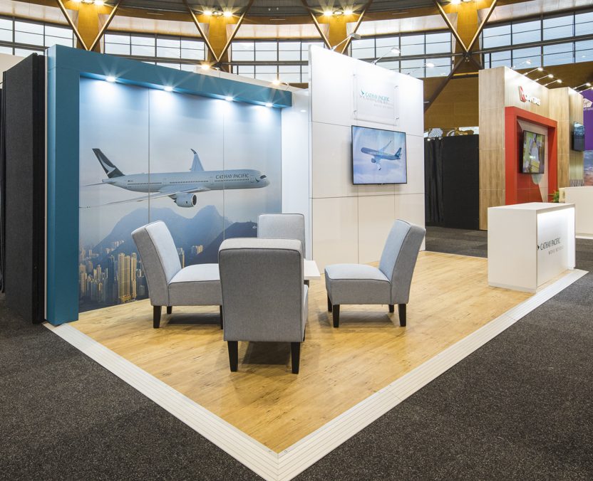
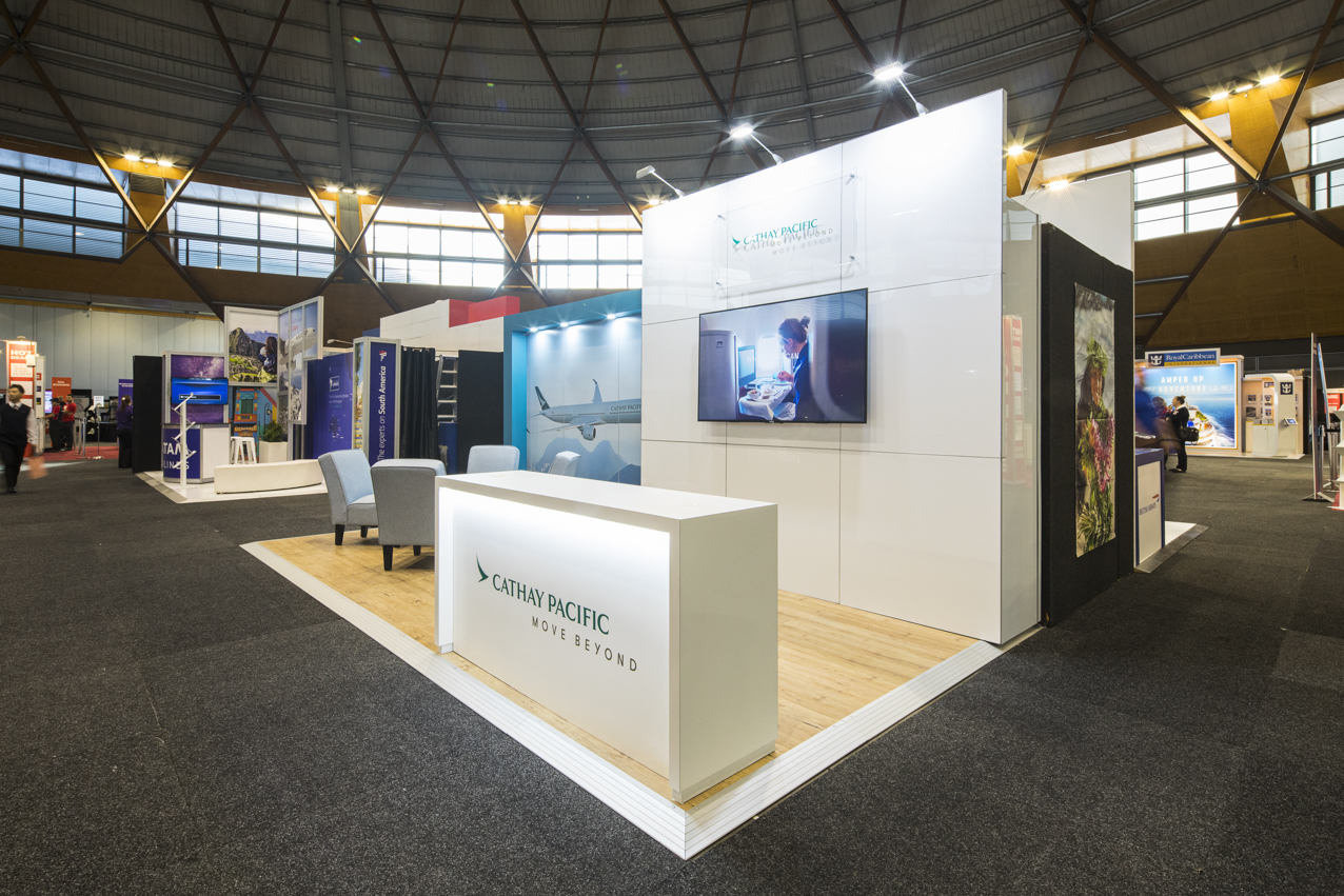
Your stand layout is more than a spatial plan — it’s a guided customer journey. The best exhibition stands are designed to intuitively move visitors through a sequence: from entry, to discovery, to conversion.
Common Pitfalls:
• Cluttered entry points
• Dead zones where people get “stuck”
• Spaces that block sightlines or product visibility
Strategic Fixes:
• Open corners and wide entries: Encourage approachability and reduce intimidation.
• Zoned experiences: Create defined areas for browsing, demos, and meetings so visitors naturally transition from one phase to the next.
• Traffic mapping: Think of your stand like a mini retail store. Where are visitors most likely to pause? Where will your staff stand? These decisions influence dwell time and flow.
Pro Tip: Even a smaller space can feel expansive if you remove unnecessary walls and use light strategically.
2. Messaging That Stops People Mid-Step
The trade show floor is loud—visually and literally. Your brand messaging must cut through the noise, fast.
Common Pitfalls:
• Overly technical language
• Crowded banners with too much text
• Brand slogans that don’t tell the visitor what you actually do
Strategic Fixes:
• 3-second clarity rule: Visitors should know who you are, what you do, and why it matters within 3 seconds of seeing your stand.
• Hero messaging above eye level: Use concise, benefit-driven language in bold typography.
• Consistent visual hierarchy: Make your primary message the most prominent, followed by supporting points in secondary zones.
Pro Tip: Test your messaging by asking someone unfamiliar with your brand to look at your design for 3 seconds—then ask what you do.
3. Smart Space for Sales Conversations
No matter how great your visuals, it’s your people who close the deals. Your stand must enable, not restrict, their performance.
Common Pitfalls:
• No seating, forcing staff and clients to stand for long chats
• No space for semi-private meetings or demos
• Messy brochure tables or cables on display
Strategic Fixes:
• Defined conversation zones: Add stools, benches, or high tables where interactions feel natural and unhurried.
• Hidden storage: Ensure your stand has discreet places for bags, stock, or personal items so the space stays professional.
• Noise control: Use dividers, flooring, or fabric walls to reduce sound bleed and improve acoustics where needed.
Pro Tip: Give your team a “home base” – a dedicated spot with charging points, water, and marketing tools. It keeps them grounded and professional all day.
4. Visual Impact Without Gimmicks
Standing out doesn’t require flashing lights or inflatable mascots. In fact, over-designing can hurt credibility. The best stands have one or two focal points that anchor the experience and leave a lasting impression.
Common Pitfalls:
• Overuse of colour or inconsistent branding
• Unnecessary complexity that distracts from your product
• Generic backdrops that blend in
Strategic Fixes:
• Hero moment design: Choose a visual anchor (e.g., LED screen, sculptural display, illuminated logo) that captures attention from across the aisle.
• Cohesive branding: Every surface, font, and finish should reflect your brand’s style and values.
• Material contrast: Blend textures like matte cladding with gloss finishes, timber with steel, or fabric with digital displays to create depth.
Pro Tip: Design for both long-range visibility (from 10+ metres away) and close-up detail. This dual impact drives engagement.

5. Integrated Lead Capture Strategy
You didn’t build a stand to hand out free pens. You built it to capture qualified leads. Your design should make that process seamless, intuitive, and effective.
Common Pitfalls:
• Relying on staff memory to capture contact info
• Unclear calls to action or signup points
• Poorly placed lead capture devices that interrupt flow
Strategic Fixes:
• Digital lead stations: Use tablets, QR codes, or interactive kiosks to collect details in real time.
• Physical prompts: Include signage or activations that direct people to “Register here”, “Book a demo”, or “Scan to win.”
• Workflow awareness: Plan where lead capture happens—at the entry? During a demo? After a product tour?

Pro Tip: Position your lead capture zone at a natural pause point, after interest has been built, but before the visitor walks away.
What Can You Expect from Good Design?
While no design guarantees results, exhibition stands built with conversion in mind typically:
• Increase foot traffic and dwell time
• Make it easier for your team to work efficiently
• Improve brand recall after the event
• Support stronger post-show pipelines
When your stand works harder, so can your people—and your outcomes reflect that.


Common Mistakes That Undermine ROI
If you’re investing tens of thousands into attending a trade show, don’t let basic design flaws sabotage your return.
Watch out for:
• Overloading the stand with too much product or text
• Blocking key sightlines with walls or furniture
• Failing to guide people toward action (conversation, demo, sign-up)
Even small design decisions—like counter height or the direction of a demo station—can change how people interact with your space.
Why Work with Grand Stand Events?
We don’t just build stands: we build environments that support your business goals.
Our team combines:
• Decades of experience in custom and modular builds
• In-house design, project management, and logistics
• An understanding of marketing strategy and event psychology
Whether you need a simple upgrade or a custom concept, we help you design with confidence and execute without stress.

Next Steps: Let’s Design a Stand That Sells
If you’re ready to move beyond “just showing up” and start showing up with purpose, let’s talk.
👉 Contact Grand Stand Events to plan your next high-converting exhibition stand.
BRANDS WE’VE MADE STAND OUT